Catalog Font Sizes: Now More Readable!
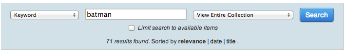
This morning I made some minor changes to the catalog keyword search results and record display pages. Since we had mashed together our University web template with the catalog template, some relative font sizes were wreaking havoc with the size of the search boxes and item listings. The bib record search box was so small I could hardly read the ranking selections below the input! So I worked through the identified issues and made things more readable by evening out the font sizes. I also converted the “Search” button to our template, making it blue rather than the browser’s default.
If you spot anything that is hard to read (or use!) in the catalog, please let me know. Remember, the free cup of coffee Bounty still stands!