On April 22, 2016, I gave the closing keynote at the 17th Distance Librarianship Conference in Pittsburgh. This is an adaptation of my talk. You can watch the video, or just see my slides, if you prefer.
In the mid-1970s, a young East German historian named Hannah Marburger found a reference to a pact signed by Hitler and Stalin in 1939.1 You'd think that as an historian, Marburger would have been familiar with the Molotov-Ribbentrop Pact, but she had never heard of it. In fact, most of the people her age and younger in the Communist East Germany hadn't heard of it. The idea that the great communist leader Stalin would have aligned himself with the fascist Hitler was unthinkable.
She found that there was a copy of this pact at the State Library. It was incredibly difficult to access. She sent multiple requests but was constantly rebuffed. However, she was persistent. She kept at it, trying to find out about the pact, pestering the librarians with her request. Finally, she was told that the document had disappeared.
She went in to visit the library, she was taken to a service the library provided that she hadn't known existed until that moment, despite the library having offered it for over 400 years. She was taken to the Giftschrank.
Giftschrank
Giftschrank translates literally as "poison cabinet," and it's used to describe the small cabinets that pharmacists use to keep their medications under lock and key. But in the 16th century, it became a tool of the library to hold dangerous texts. A poison cabinet.
While one way of dealing with texts you don't agree with is to burn them, the Holy Roman Emperor also saw value in knowing what his enemies, and the enemies of the Church, were saying in their texts. And so the Giftschrank rose up in the 16th century as a way to keep watch over these suspicious religious and political texts. It evolved through the years, and eventually became a useful tool in Nazi Germany and later in the German Democratic Republic (DDR). In the DDR, the Giftschrank became the perfect place to quarantine Western literature, or, as Hannah Marburger learned, to hide the evidence of history that the party found disagreeable.
What I love about the Giftschrank is that you needed permission to get into the room to see you material, what they called a "poison card." But more importantly, this is a library service that is unabashedly about two things that we think we've erased from libraries in the 21st century: It's intentionally super hard to access materials, and it's tied to a physical space. There is, after all, no online Giftschrank.
As I listened to an episode of 99 Percent Invisible about the Giftschrank, the producer detailed the long and winding path down stairs and through dark tunnels that a user has to take to access the Giftschrank at the Bavarian State Library today. And then the host Roman Mars landed a low blow at libraries:
The experience should be familiar to anyone who has ever tried to get a book from an academic library.
— Roman Mars
My first reaction was to be defensive: "Not all academic libraries!" I thought. "I've seen many shiny buttons on library websites!" But the more I thought about it, the more I saw value in Mars' critique. Because we, as librarians, know how to request books from the library. We understand what a "hold" is. But it can be a challenge for folks who do not have the same mental model of how a library works.
Libraries have changed a lot over the past decade. The thing that is all the rage right now is to talk about changing your physical library space. The video above shows North Carolina State University's amazing Hunt Library. (I could easily have put up a video of the library I work in, GVSU's Mary Idema Pew Library.) And what you'll notice is that it is really hard to find anything in these libraries that would have been standard library fare 20 years ago. If you watch closely, you'll see a bookshelf in the Hunt Library, somewhere, but don't blink, or you might miss it.
One of the things that's changed is that we've changed our orientation to our library spaces. A few decades ago, you couldn't even make an intellectual distinction between a library space and a library service. You walked into a library, and you saw the services laid out in front of you. But as we started moving things online, we've had to rethink what that space means. And one of the reasons we've transformed our libraries into wide-open spaces for study, for group work, and cafés, is that our physical spaces are now just one of our many services, rather than being the foundation of all of our services.

My colleague Kathy Kosinski at the University of Michigan iSchool worked on a survey of 80 undergraduates about why they came to the University of Michigan undergraduate library.2 And the students instinctively understand how the space fits into their lives. What's most important to them, is that the library is a place to study. Students see our spaces as one of our services. (Faculty, it seems, have different reasons.)
Last month Cody Hanson gave a talk at the Library Technology Conference in Minneapolis called "Libraries are Software." He didn't really like that title, actually, he wanted to say "Libraries are being eaten by software" but he wasn't sure anyone would come to a talk with that title. But one of his arguments was just this: our spaces have become just one service among many.
Library spaces are increasingly spaces for users to interact with our software.
— Cody Hanson
We're moving all of our services online into software, so that our users don't need to come to our physical spaces anymore, unless they need a place to interact with our software. And I think this is true, we're trying to move our services online, shedding the age-old idea that the library's space defines what we do. We're moving from space to screen. But the question is, have we really left the physical spaces behind?
Let's look at one common online service: Ask a Librarian. The problem with most of these services is that users have to choose to Ask a Librarian in order to use it. We don't have these links stationed at common points of failure, unless you count having a ubiquitous link to Ask a Librarian on every single page of your website the same thing.
The day before I gave this talk, I attended a session by Stefanie Buck of Oregon State University, where she heard her students tell her "I don't want to ask a librarian! I just want to know how to do it!"

This is Harvard's Ask a Librarian service. When they moved their reference service online, you'll notice that it defaults to email. But let's ask ourselves, what's the most face-to-face-like experience of communication for our undergraduate students? Is it email? No. Is it the phone? Absolutely not. It's chat, interacting with text. And Harvard has a chat service! And it's a big, blue button so it's really prominent!
However, you'll notice that the chat service is still in beta. (How do you put a service that has existed for decades into beta?) Harvard's beta likely stems from the limited hours of the service, which is available Monday through Friday, from 10am to 5pm, EST. The chat service is restricted by the physical space of the library despite the fact that it is online. The hours that librarians work has shaped the online service.
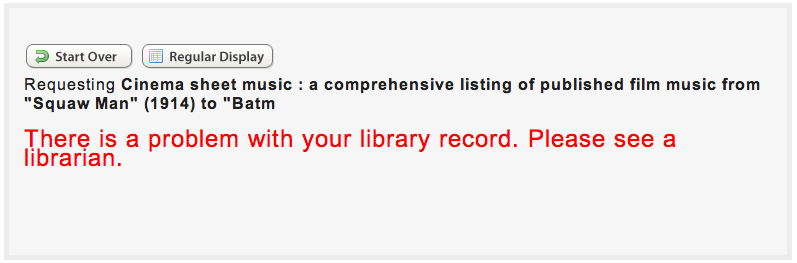
At GVSU we use Sierra for our ILS, and our OPAC has a number of hard-coded error messages that instruct users to "see a librarian." I only found these by following up on a number of service desk and chat interactions where the user mentioned that our website had told them to "see a librarian." Since these error messages are rare and hard-coded, they're hard to change.
What's the implication of this error message? That you are in the physical library when you are using the online catalog.

It is more and more common to see library websites that are "brochure-ware," describing what the library does rather than letting the users actually do it. The assumption here is that the website is not, in fact, the library, but rather is just a place to put a lot of words about all the things you can do in the physical library.

Finally, when we move our services online, we tend to shape them by our organizational structures or the ways we've organized our physical resources for the past century dictate how we organize our online services. Or, as my colleague Erin White from Virginia Commonwealth University says, "Our silos are showing!"
These are just a few examples, but I think the effect that library physical spaces have had on our online services goes deeper than this. We are still fundamentally trapped in the resource warehouse mindset of libraries when we think about online services, even as we've managed to separate that thinking out of our minds as we build and refurbish our physical spaces.
Don't believe me? Let's try an experiment.
Let's say we're going to build a library that Hannah Marburger might have gone to in the mid-1970s.
First, we'll put a sign out in front, as well as some landscaping. We want it to look nice when folks arrive so they know where they are and that we care.
We'll locate our card catalog and circulation desk right up front, but then we'll fill up most of the space with resources. Rows, and rows, and rows, and rows of resources. Since navigating those resources can be tough, we'll put some wayfinding tips right up by the card catalog. So when you find what you want, you can write it down with your little golf pencil on the back of some scrap paper we chopped up for you, and then you can look at the wayfinding to see where you need to go to find that call number.
Just in case the wayfinding doesn't help, we'll put a reference desk right back in the stacks. And then we'll put some exhibits, and some new books displays and a bulletin board with important news where everyone who walks in will see it. And finally, we'll post our hours, and some maps of the building,and some helpful tips (probably on a passive-aggressive sign) right up by the front door.
No one would build a library like this now, would they?


Here's the thing: we still build the libraries. This is how we think about our libraries, as physical spaces full of resources. Even though we might not consciously realize it, that connection between the physical library and the service is coming out in our online tools.
When we move physical items from the physical world into software, the new digital versions are often just replicas of their tangible counterparts. In design, this is called skeuomorphic design.

Think of the old desk blotter. Online calendars have the benefit of being portable, but they display the month in exactly the same way as the paper calendar (although sometimes they appear to be leather-bound). Yet the reason paper calendars are designed the way they are is a limitation of the medium, paper. Paper cannot change on its own. Once you get to the end of a month, the information of the previous 3 or 4 weeks isn't useful to you, yet it takes up most of the space. On a computer, this could easily be fixed, but most digital calendars don't offer this option. They stick to the paper-based layout because that is what we understand calendars to be.3
Last month Barbara Fister published an essay on how libraries are full of skeuomorphs:
The library is full of skeuomorphs ... a set of arcane rules and conventions to learn for those who come to an academic library with only the web and their cellphones as their cultural templates.
— Barbara Fister
Think about the library. Miss your old pathfinders? Don't worry, we've got LibGuides. Reader's Guide? We've got online databases. Card catalog? Check out the OPAC. Miss the reference desk? Try out Ask a Librarian chat service!
We've moved all these services from space to screen, but we've left the old shapes embedded in the new. The structure of the OPAC was dictated by the limitations of the 3 by 5 card. Ask a Librarian is often tied to the same hours as the reference desk.
We've changed the media by which we conduct our services, moving from space to screen. And although it's cliché to bring up Marshall McLuhan every time we talk about media, it's instructive here to help us understand what changed when we brought our services online.
For any medium has the power of imposing its own assumption on the unwary.
— Marshall McLuhan4
Here McLuhan is telling us that when you change communication mediums, the medium itself has a very strong impact on how the message is relayed. We often assume that if the content of our message stays the same, moving say between television and radio, that the message still has the same meaning. But McLuhan says that in fact, changing mediums will shape both the message sent and the message received. The content, he claims, is "like the juicy piece of meat carried by the burglar to distract the watchdog of the mind."5 That is, we're tricked by the content into thinking that the medium doesn't have any effect on our communications. By the content is shaped by the medium.
Have you every had a face-to-face conversation with someone, and then later used instant messaging or text messages to talk with that same person? The experiences of communicating in these two different ways clearly shapes the messages that we send and receive. And so, too, when we move, for instance, reference into chat.
The chat service strangles the entire conversation into something very different than a face-to-face conversation. But we didn't think about this when we moved reference online. Despite a wealth of research on virtual reference, not much has been said about this change, despite plenty of articles looking at virtual chat, most approach it from a budget or staffing perspective rather than a communication or philosophical standpoint.
The
Medium
Is The
Message
We've moved from an analog medium to a digital one. In face-to-face interaction, there is a wealth of information being communicated through many different senses. Non-verbal cues help give richness to the interaction. Moving to the phone cuts off many of those non-verbal cues, and then we lose the richness of intonation as we move from phone to chat or email. But there is more than this change that happens when we move to a digital medium, something about they way that computers work that shapes the nature of our communication.
Analog communication is a "continuous, contiguous series of differences." Think of a volume control. Even at low volumes, information is still getting through. Digital communication is binary, it's either on or off. A light switch is digital. In digital communication, you either understand or you don't.6
When we're working with someone in person, we can use the rich spectrum of analog clues to see if someone understands what we are saying. As we move more and more into a digital medium, we strip those clues away, and the binary nature of the medium routes us into binary modes of understanding: yes or no, understanding or not, for or against.
I think the best way to see how digital media shapes the way we understand the world is by watching a bit of the British show, Little Britain. Go ahead, I'll wait for you.
Now, we're thinking hard about making things easier to use and to make library online tools not quite so ugly, but we're still missing something. And that has to do with thinking about how computers shape our interactions online.
Computer
Says
No
The designer Don Norman talks about three aspects of successful design in his book Emotional Design: Why we love (or hate) everyday things. The first aspect is visceral design, which relates to all of the gut-level reactions to the aesthetics and layout of a design. One way to understand visceral design in libraries is to show a new student the Lexis-Nexis homepage. The reaction you get will be quite visceral.
The second aspect of design is behavioral design, where we talk about functionality and usability. This is where we focus on how something works, rather than how it looks or feels. in libraries over the past decade, we've worked hard to get a lot better at the first two aspects of design.
The last level of design Normal identifies is reflective design, is the most important. This is where people tell stories to themselves about how an object or service fits into their lives. And this is because Norman understands that we use technologies not for the sake of technologies, but rather to help us along in the bigger project of our lives.
Reflective design is ...about service, about providing a personal touch and a warm interaction.
— Don Norman7
One of my favorite examples of the importance of reflective design was the introduction of Microsoft's Zune media player.8 The Zune has become a laughing stock, but the thing is: the Zune was exceptionally well-designed on both the visceral and behavioral levels. The Zune was beautiful, and it was quite easy to use. It even offered more functionality than the iPod, as well as the ability to share songs with other Zune owners.
Yet the Zune was a failure, because Microsoft didn't understand the reflective aspects of design. iPods, if you remember, were almost all reflective design. Think of the ad with the dancing silhouettes with just the white ear buds visible. That ad doesn't really show the product, so it's not about visceral design. And it doesn't tell you anything about how the device worked, so it wasn't about behavioral design. That ad was all about the reflective aspect of design, and it worked. Nearly everyone who bought a personal media player in the first 6 or 7 years after the iPod was released bought an iPod, because they wanted to be one of those dancing silhouettes.
The Zune was available in a gorgeous color that was sort of anodized bronze. And what tells you that they didn't understand reflective design is that Microsoft called the color "brown." Who wants to buy a personal media player that is "brown"? It wasn't even brown, it was a shiny kind of bronze. Anil Dash suggested that they could have called it "chocolate," which would have been great: a little bit sexy, a little bit sinful. But they didn't. They called it brown. And it was a flop.
We think this way about a lot of stuff. We get trapped in the visceral and behavioral aspects. A few years ago, Emily Badger wrote a piece for the Washington Post about the changing face of transportation. She said,
We tend to talk about transportation as if the ultimate goal were mere movement, measured in speed, time and capacity. The ultimate goal of transportation, though, isn't really to move us. It's to connect us—to jobs, to schools, to the supermarket.
— Emily Badger
We get really focused on the parts of transportation that make sense universally, and we lose sight of the real reason that people go places: the stories they tel themselves every day about their own lives.
And Hugh Rundle reminds us that this is just as true in libraries:
Your members don't come to the library to find books, or magazines, journals, films, or musical recordings. They come to hide from reality or understand its true nature. They come to find solace or excitement, companionship or solitude.
— Hugh Rundle
People use libraries because they are in the midst of living their lives. We're around to help our users tell their stories, not to hijack their interactions with our own library-inspired narratives.
A good science fiction story should be able to predict not just the automobile, but the traffic jam.
— Frederik Pohl9
When we think of our services, we need to move beyond focusing on just the visceral and behavioral aspects of the technology. Because it's in the interaction with our users, the people, where we need to do the most work. If we can focus on studying and understanding what happens when our services and tools are used by people, we'll have a better shot at success. After all, what's a library without people?
And with all of this talk about services and spaces, we sometimes lose sight of that. But if we can truly get our services divorced from our spaces, we won't just make things better for the true distance students, those that cannot enter our buildings. We'll make things better for all of our users.
Your
Library
Is
People
"But we do offer help!"" you say. Do we? I have seen the ways that we offer help to users. We overload them. We send them links to LibGuides. And the thing is: this is really good stuff! If only they would read these help documents we have written, we likely would make things better for our users.
I struggled for a long time trying to find an example of an industry that faced a similar issue: having important information that they needed to convey where the users actively ignored any attempt at communication.

I couldn't think of much, and while I was sitting on the runway on my way to the conference, I tuned out something the flight attendant was saying and really tried to get some thinking done. I wanted to know who else was trying to communicate information that was important to everyone, and that users would really want to know if something went wrong. And then I remembered, that on an Iceland Air flight last year, I was enamored by the safety video they showed me that was unlike any safety video I'd ever seen before.
The video starts off in a fairly conventional way, showing travelers on an airplane. But I don't care much at this point, because I'm already on an airplane, and being on an airplane isn't why I am on an airplane.
As I watched, I realized that they had come up with a really smart way to get me to pay attention: they connected the information they were trying to get across to my whole reason for being on the plane: I was going to Iceland. They found a way to keep me in my story, my adventure in the Icelandic landscape, and bring the information they thought I should know right there.
If you watch the video above, you'll see that they manage to incorporate not just beautiful vistas of Iceland into the backdrop: they manage to work in physically the actual safety instructions with the landscape.
When I got on the plane, I was already in Iceland in my head. Iceland Air realized to get me to pay attention, they had to understand my story, my motivation. And they met me where I was.
How do we connect people with their stories in libraries? How do we go to where the students are, online, shedding our dependence on our physical spaces?
What we've done at GVSU is to target small, micro-interactions where were commonly lose students. If we want to keep people in their stories, making our services easy to use is a first step. But making sure that help is available when and where they need it, without having to hunt down an "Ask a Librarian" button is also key.
One common failure point in our catalog is the author search. WebPAC Pro wants you to enter the last name followed by the first name. This is not how people search, though. WebPAC's solution is to let you fail the first time, and then offer to switch the order of the terms and do a whole other search. Yet no one told the user that they needed to do last name first! (Some libraries do, of course, by putting red text in all caps somewhere near the search box.)
At GVSU, we tried something easier. We just watch the drop-down menu to see if someone decides to choose the author search. If they do, we change the placeholder text to say "Last Name, First Name." Since we instituted this, we've gone from having a nearly 50% of our author searches were done with the first name first. After implementing this one function, we're down to about half a percent.

We also get a lot of the same questions over and over through our chat service. Since we use LibChat and LibAnswers from Springshare, I built a little tool that integrates them. You start typing your question, and the box gives you up to 5 possible answers that might help you immediately.

One other issue that caused a lot of cognitive overhead is filling our request forms for Interlibrary Loan or Course Reserves. Instead, we just have one request form that has a check box that toggles between digital copies and physical books to simplify the process of getting something from one of these services. The underlying metadata was actually the same for nearly every other item type that Atlas Systems created for both of these services, so I have no idea why they made their options so complicated. But by getting out in front of these common roadblocks, we were able to help our users be successful.
This past week, we made a small change to our Interlibrary Loan request form. For many reasons, we want folks to first search GVSU holdings for books, then search MeLCat, our consortial catalog, and finally, if they can't get what they need from those two sources, to submit an Interlibrary loan request. The problem is that MeLCat is a separate website that I have no control over. Once I send someone there, I can't get them back unless they navigate back to our website.

So we thought of all kinds of ways we could control the flow of our users as they searched for books when it hit me: stop trying to make the user come to some page we've created that will set them straight. Go to where the users are. And every user that submits an ILL request instead of a MeLCat request comes to Interlibrary loan. I wrote a simple script that does a title search for your item and lets you know if it's available in MeLCat, even giving you a button that will take you right to the request page.
(Every month we have between 75-85 users who request items from ILL that could have been requested from MeLCat. Not only will the users get things faster, but MeLCat requests are effectively free to us, while ILL costs per request.)
Rather than focus on really big issues, I work to find those areas of our online services where we can make things easier for all of our users, by removing roadblocks and the traces of our physical spaces.
Good technology makes us feel like we are inching closer to who we truly want to be.
— Frank Chimero10
Like our services that were grounded in our physical libraries, our online services should help make our users better versions of themselves. But we can only do this by being conscious of the changes that took place when we moved our services from space to screen, and by recovering the reflective aspects of our designs. By focusing on how people interact with our services, and how they use our tools to live our their goals and stories, we can all succeed, together.
Footnotes
- Plum, C. (2015). Antifascism After Hitler: East German youth and socialist memory, 1949-1989. New York: Rutledge. pp. 1-2.
- The team at University of Michigan's iSchool was: Denise Foley, Kathy Kosinski, Ariel Ojibway, Emily Puckett Rodgers, Stephanie Rosen, Chelsea Trull, and Colin Wassell.
- For a really thoughtful treatment of skeuomorphs in digital design, see Frank Chimero's What Screens Want.
- McCluhan, M. (1964). Understanding Media. New York: McGraw-Hill. p. 15
- McLuhan, p. 18
- Wilden, A. (1972). System and Structure: Essays in Communication and Exchange. London: Tavistock. pp. 155-156.
- Norman, D. (2004). Emotional Design: Why we love (or hate) everyday things. New York: Basic Books. p. 88.
- Lombardi, V. (2013). Why We Fail. Brooklyn: Rosenfeld Media. pp. 88-94.
- Try as I might, I've never found a reputable citation for this, although I've seen the quote several times, always attributed to Pohl.
- Chimero, F. The Space Between You and Me. The Manual, Issue #1, 2012. p. 26