This afternoon I gave a talk at the 2014 Library Technology Conference on Pizza Hut architecture, Bill & Ted’s Excellent Adventure, and using data for UX work in libraries.
I recorded my session in case you want to watch it (a transcript is included below). You can also find my slides on Speakerdeck, or listen to the talk on Huffduffer. Thanks to the Library Technology Conference folks for having me, and for the awesome folks who came to my talk and laughed at my dumb jokes.

——
I grew up in a town known for manufacturing. Furniture, automobile parts, canned soda, and pickles were what put food on my friend’s tables. But by the early eighties factories were closing and left empty. In turn, small businesses that relied on the laid-off workers began to close. Riding through town with my Grandfather or father, both lifelong residents, I learned about these empty buildings and what they had once been, how much they had meant to the city. My Grandfather told me about the old Baker furniture plant, and how my great-Grandfather would show up every morning during the depression to see if they needed any extra workers that day. He showed me the building that saved his life when he was ejected from his car in an accident. The building stopped the car that was rolling over behind him, while he slipped past the empty space where a corner should have been. We drove past the empty building that had been his childhood home, the Reidsma IGA Grocery, as he told me about they day they removed the horse troughs after paving the last dirt road into town.
The town has had a remarkable comeback. Now the Baker furniture plant and the Reidsma IGA are apartments and condos. The building with the odd shape that saved my grandfather’s life has been torn down, along with my old elementary school and the gas station shaped like a Windmill, where I bought baseball cards. The house I grew up in was recently gutted, and is unrecognizable to me. The stories of what these buildings used to be are stored away only in the memories of the people who knew them.
But there was always one building in town, my Grandfather and I joked, that we would recognize no matter who the tenant was. A building that encoded its own history and origins right in the roofline and the trapezoidal windows. And that was Pizza Hut.

We weren’t the only ones interested in Pizza Hut’s unique architecture. I saw a photo in the Onion over a decade ago teasing the chain for its distinctive architecture. And there is an entire blog dedicated to documenting buildings that Used to Be a Pizza Hut: the Indian restaurants, the Chinese restaurants, the liquor stores, the Doctor’s Offices, and the adult superstores. With former Pizza Huts, you don’t need to consult the memories of people who visited the salad bar to know it was a Pizza Hut. The restaurant leaves a trace of its time behind in the form of that distinctive red roof and those trapezoidal windows.
——
For a long time, we needed to rely on the memories of our fellow staff members, our institutional memory, to know what our patrons did in the library. Despite the greasy fingerprints in the card catalog and the rubber stamped due dates, patron usage didn’t really leave much of a trace behind, other than in the memories of those who witnessed it.
But that changed in the eighties and nineties when most of us started putting our collections, tools, and resources online. These systems collect gate counts, database counter statistics, book circulation statistics, interlibrary loan requests, website analytics, questions asked. But these systems are often maintained by the people who are responsible for individual tools. Each of us in our own little corner of the library hones in on our little mound of data. Your Interlibrary Loan person can recite article requests and budget numbers from three years ago to the present if you asked. Maybe you see Google Analytics charts or acquisitions by LC Call Number dancing in your head at night.
We each have our one piece of data for our one tool and we focus on it.
This data only comes together for annual reports to accreditation boards or library organizations that ask us to fill out a survey. But these data trails are like those distinctive features on old Pizza Huts, traces of our patrons’ journeys weaving through our various tools and services, moving from one system to another in the attempt to accomplish their goals.
It’s one thing to see an old Pizza Hut in your hometown and recognize its story. It’s another to spend some time browsing the stories of hundreds of former Pizza Huts around the world, seeing the trends and understanding that your own local building is just part of a larger movement. In our work, seeing how our little fiefdom of data fits in with the others throughout our library is a necessity if we are going to make user-centered services. Because where we see individual tools, our patrons see a holistic service platform.
——
I speak and write a lot about user experience research and how libraries should be talking to their patrons, testing their services and tools. But the reality on the ground is that many libraries don’t have the time to conduct usability tests and interviews, let alone spend time building a culture of UX in the library. We’re each too busy creating our own little fiefdoms of data.
What if we could harness that data to make libraries better? What if we looked up from our individual tools and saw things as a continuum, the way our patrons experience our services? It turns out there is already a great example of how to make this work, a framework for collecting the relevant data from our past and using it to make a better future. A framework you’re probably familiar with.
I’m talking about Bill and Ted’s Excellent Adventure.
—
If you weren’t born yet or weren’t spending 1989 looking for hair metal bands your parents wouldn’t approve of, I’ll give you the short version of the film: The peaceful future of the universe somehow depends on Bill and Ted achieving success as musicians, which they can’t do unless they get an A+ on their high school history presentation. George Carlin comes to the rescue in a time traveling phone booth so that Bill and Ted can learn first hand about history. The duo travel all through time, picking up important historical figures like Socrates, Billy the Kid, and Joan of Arc, and then put on a remarkable presentation where the great figures of history talk about their lives and work.
Here are seven lessons that Bill & Ted’s Excellent Adventure can teach us about getting out of our data silos and making our libraries most excellent for our patrons.
1. There is useful data just sitting in the past. Go get it.
Bill and Ted traveled around, collecting data from many different periods of time, jumping around to different points in the past. Through this they learned that immersing themselves in the past made it easier to see the value in that data (mostly through “historical babes”).
Your library systems have probably been collecting data on how people use your tools for years. Your OPAC records the searches your patrons enter, the books they check out, the items they request. You’ve also got data on your gate counts, your web visits, your database COUNTER statistics, and your interlibrary loan requests (and loans). You might have course reserves or LibGuides data, or maybe data on attendance for events or participants in scavenger hunts. I have three years of transcripts from monthly usability tests. Figure out what you have and look at it. Not just once—make it a habit.
Once a week, I check the following sources of data:
- Questions asked at the service desk or over the phone1
- Emails sent to the main library email account
- Tweets sent to the library (and related searches)
- Reference chat transcripts2
- Google Analytics
Sometimes you’ll find you don’t have enough, or you don’t have the data you want. That’s okay. You can always start collecting the data you want now. Our discovery service, Summon, doesn’t track things like what number results get clicked on, or whether facets are used. In fact, every time a facet gets clicked, Summon counts it as a new search! So we wrote a new statistics package that sits on top of Summon and gets the data we want. We did the same thing for our OPAC (Sierra’s WebPAC). We now have a good year to a year and a half of every search that has been done on these two systems, as well as how each of our patrons interacted with the results. That kind of data is really useful.
2. Think broadly.
The report required Bill and Ted to talk about 3 figures from different periods of history. They had a little time left after getting their three historical figures, so they went and got a bunch more (Extra credit!)
Get as much data as you can handle. Go back farther than you think you need to, and grab more systems than you think you need. You’ll probably find some gaps in what you have, so you might end up supplementing with some new research to learn more about what people are up to.
My favorite way to get more data is during usability tests. Besides asking relevant follow-up questions to each scenario, I always let the student go a minute or two after I think we’ve learned everything we can from them. I always see some new behavior that gives me a better understanding into how students perceive the library website, and it only takes an extra minute.
We’ve recently moved into a new building at GVSU, and are running a lot of studies to learn how our patrons use the new spaces. One of the things we’re really interested in is the density of specific areas in the building. For a long time, we didn’t have a way to get that data directly, so we looked to other measures to help us. I started recording how many computers were in use on each floor to gauge how heavily used the collaborative computer areas were on each floor, and I even started collecting the counts recorded by our water bottle refill stations to see which floor had the highest number of refills. (The third floor.)
Eventually, our UX team developed a way to do head counts based on quadrants of each floor to better gauge how students were distributed at different times of the day. But that still only gets you so far, so they are supplementing that with a qualitative “Library Use Journal” survey to learn a little more about how and why patrons use the library in the ways they do.
3. You don’t have to be an expert.
Bill and Ted had very little idea of what they were doing. They knew just enough to know where to find the data (and they had help-the Circuits of Time book). And because they didn’t have a predefined idea of what an A+ presentation looked like, they made something unique that worked.
This can be a tough one, because no one likes to admit they don’t know something. But like Socrates, the best way to move forward is to admit that we don’t have all the answers. The key is wanting to find out what the answer is! In the documentary Eames: The Architect and the Painter, Richard Saul Wurman describes Charles Eames’ drive to learn new things as the key to his success:
You sell your expertise, you have a limited repertoire. You sell your ignorance, it’s an unlimited repertoire. [Eames] was selling his ignorance and his desire to learn about a subject, and the journey of him not knowing to knowing was his work.
4. Keep an open mind.
Bill and Ted didn’t really have any preconceived ideas of what to expect in the past (or how to behave, really). As they met each of the historical figures, they didn’t pigeonhole them into a caricature of themselves. They were open to the unique experience each figure brought. During the presentation, they even let the figures speak for themselves.
Too often, we often start with solutions, rather than trying to understand problems. And when we already have an idea of what we want to do to make “things” better, we tend to skew everything to fit our preferred solution. I think the best way to explain this is by watching the West Wing:

The Mercator projection was designed for a specific purpose: to aid navigation across the ocean. But that purpose has skewed the value of the map for the rest of us who aren’t navigating ships. As Frank Chimero puts it:
A map’s biases do service one need, but distort everything else.
In libraries, we often have a pretty good idea of how we think things should work, and these assumptions guide us as we try to solve real problems facing our patrons. When we moved into our new library this past summer, we talked a lot about how we hoped the building would be for the students, a place they could use in the way they needed. We avoided creating any policies about how things should run before we actually got in the building (and frankly, we don’t have many policies now). We let students create their own etiquette around our group study rooms rather than imposing policies that restrict how they can use the library’s spaces. We’ve even had students “reserve” public spaces for study by simply writing “This place is reserved tonight from 5-6pm” on white boards and wheeling them into place. Rather than telling students they couldn’t do that, we asked them why they didn’t use one of the reservable group study rooms so we could better understand their needs.
In my work, I use a technique for making connections in the data without letting my pre conceived biases guide me. Empathy maps are tools that helps you collect a variety of data and sort them into categories of human perception. It’s a way of keeping your data focused on the people you are hoping to serve.
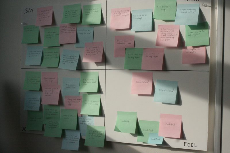
In this map, I took data from 3 years worth of usability tests—my own notes, recordings of the sessions, notes from other observers, blog posts I wrote about the changes—and sorted the data into four quadrants: things that people see, say, think, and feel. The data about thinking and feeling came from watching non-verbal cues, but also from asking them what they were feeling or thinking if they weren’t saying what was on their mind. The empathy map is really a tool to get a lot of data out of a list and into a form that keeps it focused on users.
5. Tell a story.
The genius of Bill & Ted was that they didn’t just recite dates and facts. They contextualized the historical figures, and presented them as narratives. This is one of the reasons that tools from the quantified self movement like Fitbits are mainstream now. They don’t just present you with raw data and facts. Rather, they help you make the connections between events by creating little narratives.

Nicholas Felton has made a career of this. His Annual Reports are wonderful exercises in converting data into storytelling. In 2010, after the death of his father, Felton used old photographs, receipts, datebooks, and other ephemera to piece together a story, told in data, about his father. If he simply had enumerated a list of appointments, the result wouldn’t have been so compelling.
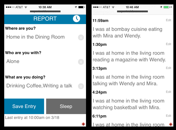
Inspired by Felton’s Reporter app from his 2012 report, I built a little web app last year that has a short survey on it that I fill out every 90 minutes.3 But I’m not just interested in aggregate data about how many times I see Jon Fink or Cody Hanson every year, but rather the narrative of the context that pulls this data together. The whole structure of the app is based on telling stories about these little moments.
And any of us that have tried to make sense of a bunch of raw data and use it to make our library services better know that it’s hard to do. We need to take the time to see the connections, the stories, that sit inside the data, and bring that to the forefront. Our patrons don’t experience our library as a set of data points, but rather as a narrative playing out in their own lives. And our coworkers are rarely moved by a decontextualized spreadsheet. Aarron Walter, the head if UX at MailChimp, points out that this is the only way your data is going to make a difference in your organization:
Research cannot create change in an organization until it’s turned into a compelling story.
User Journeys
At GVSU, we have a few ways to turn data points into stories. First, we think in user journeys and complete tasks, rather than individual tools. By centering our focus on the tasks patrons do, we get out of the siloed approach to working with our tools. Very few of our patrons ever experience our Document Delivery site by itself. Rather, they do a search in our discovery service or a subject database, find a citation they are interested in, and discover we don’t have the full text. Often, this takes them from their search service to our Link Resolver. From the Link Resolver, many of our Document Delivery users click an OpenURL link that populates the request form in Illiad for them, but others try another database or search our catalog before committing to the request. By tracking the possible paths patrons can take to get to our tools, we can make sure to spot roadblocks in their way and fix them. And we do this all through breaking down the patron’s journey into its composite parts, and then assembling them into a narrative.
Personas
In addition, we use a few personas, or typical users, that were built out of data we’ve collected over the past few years. When I built our most recent empathy map, I was able to distill our student population into 3 broad groups: undergraduates studying hard or health sciences, undergraduates studying social sciences or humanities, and graduate students. Most of the behaviors of these groups overlapped, but there were some striking differences. Hard and health science students are impatient at GVSU. They don’t have time to request items from Document Delivery, and they aren’t interested in resources that aren’t available in full text. We saw these behaviors and quotes in student after student in this particular group, but never saw it in humanities undergrads or graduate students. That told me that they needed their own group.


But the Empathy map is more like a spreadsheet of data: it doesn’t have the context or the connections between different data points made explicit. The persona is a way to match the demographic information about your user groups with particular needs and goals. By giving each of our personas a name and a photo, we have an easy shorthand for talking about large user groups. Instead of asking about the behavior of health sciences undergraduates, we can simply say, “would Amanda be confused by this?” Personas are a good way to keep your focus on the patrons as people, rather than getting bogged down in demographic data.4
6. Be excellent to each other.
Bill & Ted weren’t just making a presentation for a history class, they were changing themselves, putting in effort to learn to do something. They were changing the culture of the world around them.
A lot of the ideas in this talk require a particular kind of culture to work, and that culture hasn’t been fostered in libraries much. But by putting forth the effort to really make a difference in your own work, you can have bigger impacts on the way things around you happen. It’ll be a slow process, but you might make some headway in building a more user-focused culture if you’re patient.
Since you’ve collected a lot of data, sorted through it and created some tools and narratives to help make sense of all this information, share it with others! Tell those user stories to your coworkers, don’t horde all this data in yet another silo. Get it out there, doing some good.
A few years back, my colleague Kyle and a ridiculously talented graduate student set about to built an analytics dashboard that would give library staff real-time data on any of our systems. They made a great product, but the maintenance was a nightmare since the connections to each system were fragile and broke every time a vendor changed things.
Then last fall, Aarron Walter from Mailchimp wrote an article about how they share UX data in their company. At the time, we had just hired a new full-time UX Manager to handle the physical spaces of the building (I handle digital UX), and she and I set about coordinating our efforts. Based on Walter’s plan, we created an Evernote notebook, and set about dumping a lot of data into it every week that could be quickly searched by anyone in the library who needs to know data from Google Analytics, or LibAnalytics, or the results of the last round of user interviews can search the notebook. It’s not as elegant as Kyle’s vision for the Analytics Dashboard, but it gets the job done (although it hasn’t been widely adopted in the organization yet).
Since a lot of our data is collected manually, I also started offering an incentive to anyone who collected data as part of their daily work that led me to make an improvement on the website. My Data Bounty has been quite popular, and I’ve bought free coffee for several coworkers and students.
But don’t just stop at sharing with your coworkers. Libraries, as Cody Hanson has reminded me a few times, like to believe in their patrons’ exceptionalism. We all think that our patrons have such radically different needs than other libraries, that we can’t possibly learn anything from their data. But we spend so much time trying to find the things that are different about patrons (and patron groups) that we often miss what is the same, which is most everything.
We built public Github repositories into our workflow to push new projects live. Every bit of code we write is automatically shared publicly. I write up the results of our usability tests every month and post them publicly in my Work Notes. Cody and his team at the University of Minnesota upped the ante by ranking other Committee on Institutional Cooperation Libraries on one crucial web metric: page speed.
7. Focus on outcomes not outputs
Bill and Ted spend the majority of the movie putting together a history report, but it isn’t really the report they are working towards. It’s not even the A+ they know they need. Rather, they are working toward an outcome—keeping the band together—and they are flexible in how they get there.
Too often we get focused on the features we think we be good for students - Advanced Searching! Boolean Operators! A single search box! A tabbed search box! But these are outputs, lists of features we have specified we want to add to our services. If prodded, we’ll all admit that these features are ultimately in service of a particular outcome, like increasing the number of patrons who make it through the link resolver to their full text article, or decreasing the number of citation questions at the service desk.
A while back I was asked to build a page that would provide easy access to all the various places our staff has to enter data. The assumption was that data was not getting entered because folks couldn’t find the different systems. But during my initial interviews, I learned that everyone knew where to enter the data. They had bookmarked the systems and used them at times. But because the purpose of the data collection was never shared, they didn’t see much incentive to put their data in. Because I was able to focus on the outcome—get more and better data—I was able to scrap the original output requested and work to solve the problem another way.
If we focus on those outcomes instead of the outputs we are sure will get us there, then we free ourselves up to find the best solution for the problem. But this is a cultural shift more than a technique you can employ. This requires autonomy, and that might threaten your existing organizational structure. But Jeff Gothelf in Lean UX makes this pretty clear:
[Teams] must be empowered to decide for themselves which features will create the outcomes their organizations require.
Ultimately, the way I approach design at GVSU is that I’m testing hypotheses.5 I look at data and uncover potential problems, and through research, I try to get a holistic view of what is happening (see steps 1-5). Then, I brainstorm, often with coworkers, a bunch of possible solutions. Then we think about which sounds like it might work. We try that one, and test it. If we get the outcome we hoped for, we move on to the next problem. If not, we try a different one. Sometimes we fail, but it’s okay as long we learn something and we make it better in the end.
——
Last fall I heard Karl Fast give a talk about data. In it, he shared that now, everything is data. Astronomers, who used to spend time looking at stars, now deal with data. Stars have become data. Biologists now deal more with data than with plants or animals. Even Pizza Huts have become data.
For Fast, our task is not so much to collect the data, but to represent it in such a way that we are able to move forward, to take some sort of action.
I use data a lot in my job, although I’m not data-driven. I’m data-influenced. The data helps us make better decisions at GVSU, and has helped make us a better place to work and a better library for our patrons. I hope it can help you, too.
——
- Until this year, we used a heavily-customized version of LibStats. Now we use LibAnalytics from Springshare. ↩
- We use LibraryH3lp. ↩
- If you have time, Felton’s talk at EYEO in 2013 goes into a lot of detail about the Reporter app he made for collecting data in his 2012 report. Felton’s more polished Reporter app for iOS was recently released to the public, although I was impatient and built mine last summer. Someday I’ll package it up and put it on Github. ↩
- Our personas are pretty simple: just a few items of demographic information, needs and goals, and reminders of how we can serve their particular needs. Personas can be really complex, but simple is sometimes better. I was heavily influenced by the persona sections in Lean UX for developing ours. I got the names from a random name generator, and the photos from Greg Peverill-Conti’s Creative Commons Flickr series “1000 Faces.” For more on user journeys and personas, Newfangled.com recently ran a great article on using tools to communicate how the user sees your services. ↩
- I got outcomes vs outputs from the book Lean UX by Jeff Gothelf & Josh Seiden, and they also gave me the vocabulary of hypothesis testing to describe the way I practice design work. ↩